Gravel, Brick or Stepping Stones: Reading a Garden Surface
Compare gravel, brick, and stepping stones by texture, visual weight, and mood to choose a garden surface that fits the space and its planting.
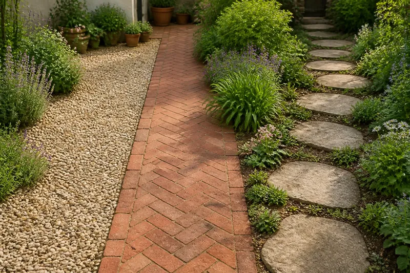
A garden surface changes the character of a space before you notice its plants. To read a garden surface, begin with what your eyes and feet register: gravel scatters attention, brick draws it into a pattern, and stepping stones leave open ground in view. Comparing those effects can help you choose a material that belongs with the garden rather than competing with it.
This is not a guide to laying a path. Instead, it is a way to look closely at three familiar surfaces and decide what each one says in a particular setting. The useful questions are simple: What does the texture invite you to notice? How much visual weight does the surface carry? And what feeling does it create beside the plants and boundaries?
Start with the view
Stand where you are most likely to see the surface as a whole: a kitchen window, a doorway, or the place where a path meets a patio. Look at the ground before inspecting individual plants. Notice whether it appears as a continuous field, a distinct band, or a sequence of separate marks.
Then walk to another viewpoint. A surface that seems quiet from above may become prominent at eye level, especially where it meets a low wall or dense planting. This change matters because garden materials are seen both as patterns and as objects underfoot.
Pay attention to the proportions around it, without trying to measure them. A broad sweep of paving reads differently from a narrow track, even when both use the same material. Likewise, a small patch of pale gravel may catch the eye more strongly than a larger dark surface. The first useful decision is not which material looks best in isolation; it is how much attention the ground should claim in this space.
Read the texture
Gravel is made of many separate pieces, so its texture breaks up the ground into fine visual detail. From nearby, individual stones create variation; from farther away, they tend to merge into a softly mottled field. The impression can feel informal and changeable, particularly when the gravel sits beside loose, naturalistic planting.
Brick has a more legible surface pattern. Its faces and joints make a repeated rhythm that can feel orderly, warm, or familiar. The pattern may be subtle if the brick tones are close together, or more pronounced when color and joint lines stand apart. Brick usually gives the ground a defined presence without the scattered grain of gravel.
Stepping stones create pauses between pieces. The visible ground around them becomes part of the composition, so the material is not only the stones themselves but also the spaces between them. A sequence can feel light and open, while large or closely grouped stones may read as a stronger, more continuous feature.
Texture is not just a matter of touch. Imagine a garden with soft-leaved plants and a dense border. If the ground is fine gravel, its small-scale texture may echo the detailed planting; if the ground is broad brick, the contrast can make the border appear more relaxed. Neither effect is automatically better. The question is whether you want harmony or a clear change of character.
Judge visual weight
Visual weight is the sense that a surface occupies attention. Color, pattern, contrast, and the amount of open ground all contribute. A dark material may feel settled and substantial; a light one can seem more noticeable, especially in shade. A strong repeating pattern can also carry weight even when its color is subdued.
Gravel often reads as a field rather than a set of separate objects. Its visual weight depends on its color and the size of the area: a pale expanse can brighten the view, while a darker one may recede. Because the surface has no single dominant unit, it can soften the transition between planting beds and a more formal boundary.
Brick announces its shape through repeated edges and lines. That gives it a stronger graphic presence than a similarly colored spread of gravel. The pattern can make a garden feel composed and grounded, but it may also draw attention away from plants if the pattern is very distinct or fills a large part of the view.
Stepping stones tend to distribute attention rather than gather it into one solid plane. The eye can move from stone to stone, then into the visible soil or planting between them. This can preserve a sense of openness, though a dramatic stone color or unusual shape may make each piece stand out.
For a quick comparison, imagine holding a plain sheet of paper beside a patterned one. The plain sheet reads as one quiet shape; the pattern gives the eye more to follow. Gravel, brick, and stepping stones behave in a similar way, though their color and surroundings alter the result.
Match the mood
Now consider the feeling you want the ground to support. Gravel can suggest informality, softness, or a dry, open character. It may suit a garden where planting has varied outlines and the boundaries are not meant to feel crisp. The same gravel can look restrained when its color is quiet and the surrounding forms are simple.
Brick often lends a sense of enclosure and familiarity. Its repeated units can connect the ground visually to a wall, edging, or nearby building, especially when their tones relate. If there is no such visual connection, brick can still provide a deliberate counterpoint to foliage, but its pattern may become the main event.
Stepping stones can make a garden feel provisional or gently informal because they show more of the ground between each piece. They can also feel carefully composed when their shapes and spacing make a clear rhythm. The mood depends less on a label such as “casual” than on the relationship among the stones, the open spaces, and the planting.
Say you have a small courtyard with leafy pots, a plain wall, and a view from the kitchen. Imagine choosing brick in a warm tone that echoes a nearby clay pot: the repeated surface pattern would give the floor a settled, connected feel. If you instead imagine pale gravel, the ground would read as a softer field and the pots might stand out more clearly. Those are different visual outcomes, not promises about how the garden will feel in every light.
Compare the three surfaces?
Does gravel make a garden look softer?
It often does because its many small pieces form a less sharply defined field than a repeated brick pattern. Color and area still matter: strongly contrasting gravel can become a focal point rather than a quiet backdrop.
Does brick always look formal?
No. Brick’s regular units create visible order, but tone, pattern, and neighboring plants shape the mood. A restrained brick surface beside loose planting can feel warm and settled rather than strictly formal.
Do stepping stones make a space seem larger?
They can leave more ground visible than a continuous surface, which may make the composition feel open. If the stones are bold or closely grouped, however, they can command attention and make the space feel more defined.
Can one garden use all three?
It can, if each material has a clear visual role and the changes between them make sense in the overall view. If every surface has a strong pattern or color, the garden may feel visually busy rather than varied.
Make the comparison
Use a simple observation routine before deciding. It keeps the choice tied to the actual garden instead of to a sample seen by itself.
- Look from the main viewpoint. Notice whether the surface forms a field, a pattern, or separate stepping marks.
- Check it beside planting. Ask whether its texture echoes leaf forms or creates a useful contrast.
- Notice color in context. Compare the surface with nearby walls, pots, edging, and the greens around it.
- Follow its visual rhythm. See whether the eye rests on the ground, moves across it, or travels through it.
- Consider the amount of open ground. Decide whether visible spaces between stones support the garden’s character or make the composition feel interrupted.
- Return in another light. Observe whether the surface becomes more prominent or quieter as shadows shift.
These checks are not a scoring system. If the garden needs a calm base, favor the option that recedes beside its main features. If the ground should provide structure, a clear brick pattern may do more for the composition. If openness is part of the desired character, stepping stones may keep more of the surrounding ground in the picture.
Read transitions
A material rarely appears alone. The edge where gravel meets a planted border, or brick meets a wall, can be as noticeable as the central surface. Look for whether that edge feels crisp, soft, or visually uncertain. A strong contrast may clarify the boundary; a close match can make the change less conspicuous.
Transitions between two ground materials need the same attention. Ask whether the change marks a real shift in the garden’s character or simply adds another pattern. For example, moving from a defined brick area to individual stepping stones can signal a change from a settled gathering place to a looser passage. If the areas sit side by side without a clear reason, their different rhythms may compete.
Plants affect these edges over the seasons, too. Foliage can partially hide a boundary, while bare stems may expose it. A surface that seems balanced when surrounded by full leaves may feel more prominent when those leaves are gone. Consider the view in both conditions rather than judging the material against one moment of planting.
Choose by character
After comparing texture, weight, and mood, describe the effect you want in a few plain words: quiet and open, patterned and settled, or broken and informal. Then look again at the three options through that description. Gravel generally offers a fine-grained field; brick gives a distinct repeated pattern; stepping stones leave open spaces between visible units. These are starting tendencies, not fixed rules.
Pay attention to the material’s color and the scale of its pattern in the actual setting. A small sample can show tone, but it cannot fully convey how a large area will read as one shape. If you are considering a substantial change, check the product label, manufacturer guidance, and relevant local requirements; seek a qualified professional where site conditions or safety concerns call for specialist advice.
Reading a garden surface is a matter of noticing what the ground asks your eyes to do. Gravel gathers into a textured field, brick sets out a rhythm, and stepping stones let the spaces between become part of the design. Start with the view you care about most, then choose the surface character that gives the plants and surrounding materials the kind of company they need.